It’s always a good idea to change things up. But sometimes, less is more. And going back to basics is a good thing.
Back to basics
We continue to add new products to the website. Currently, 393 products make up the Product Gallery. Each time we add a product, the website seems to get a little slower. In today’s world, a slow website means people won’t wait. Google Analytics calls that Bounce Rate. A high Bounce Rate means that people usually don’t look any farther than the home page.
Working with our website designer, we identified several things that might be causing our issue. First, Greg found large media files. Once optimized, the website speed was marginally affected. The feature photo slider also added delay. But the biggest resource hog was the Essential Grid plugin. After removing the slider and grid, the speed was amazing!
Removing the bling
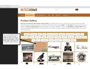
Remember what the Product Gallery used to look like? Product tags (aka filters) topped the area where product images were seen. You hovered over the image to see the product name, price and Read More button. Once you clicked on the name, the full product display appeared. Pretty to look at, but not worth the impact to the user experience.
The New View
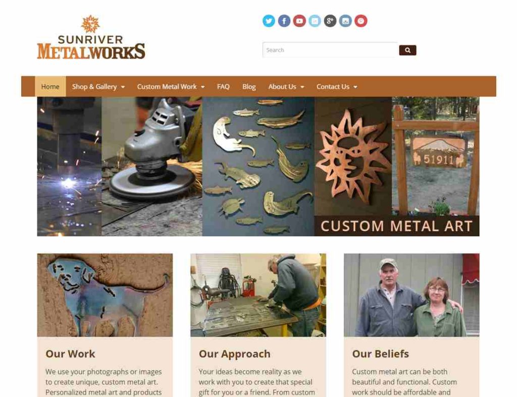
Now the responsive home page provides a snapshot of our work, as well as navigation.
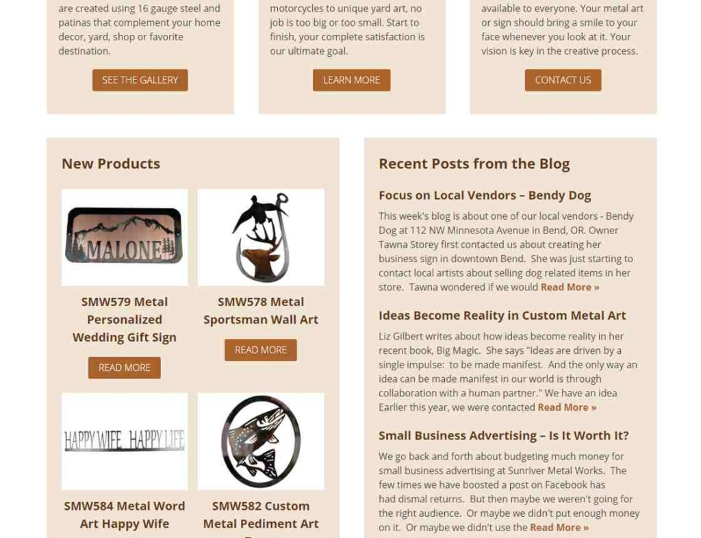
Finally, you are able to see the most recent products added to the website. Weekly blog posts are also featured.
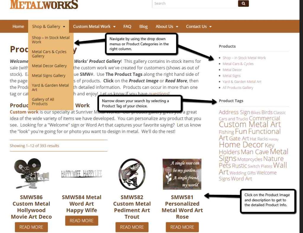
Product Gallery loads quickly!
A few changes have been made to the Product Gallery to improve speed. You navigate easily to the product details even with the bling removed.
Let us know what you think
We’re very happy with the changes we’ve made. Our potential customers can find items more quickly. We’ll be watching our Bounce Rate and hoping it decreases. Also, our mobile customers should find it easier (and quicker) to view our products. As an aside, mobile is 50 percent of our audience. Amazing!
The website has been tuned as much as possible now. It’s bare bones and back to basics. We hope you approve!


