People request text in many of the custom metal art and sign projects we work on. Using text can be as simple as your address numbers, name, or ranch name. They all follow the same types of consideration.
Using Text
As a general rule, we keep text to 1-1/2 inch minimum in height. We know that this size will create readable and cut-able text.
Depending on how you want to use text, we may need to modify letters. For example, an “O” may need a connection point to the steel at the top and bottom of the letter. Otherwise, the center will fall out, and you’ll just see a big empty space. More on that later.
Everyone, and we mean EVERYONE, has a different idea of what type of text they envision in the finished piece. SCRIPT to some is a very flowery and flowing text. To others, it means a font that connects all the letters together. You get the picture. Many customers ask for our recommendation, and we go from there.
We also ask people how the text will be displayed. If you are mounting text on a contrasting wall, the text will show up. If you are mounting a single layer sign outside with no backdrop, the letters will probably “disappear”. You won’t be able to read the sign. Double layer signs are usually a better answer for this type of sign.
Single layer text signs
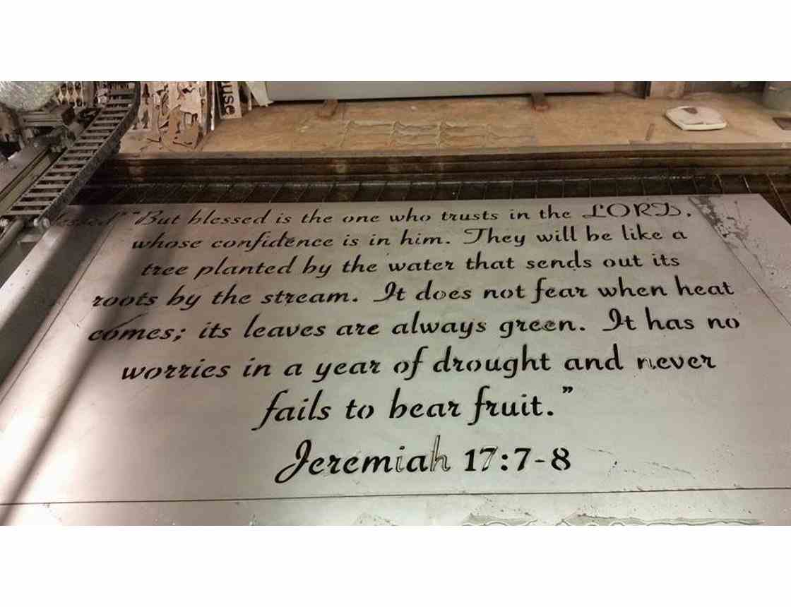
In this Jeremiah scripture example for The Grove, the customer wanted to create word art for a large space in their clinic. They gave us an example of the font they wanted to use and purchased the font. Since it would be mounted on a contrasting wall, a single layer sign would work well. The majority of the letters were 1-1/2 inches tall, with the exception of letters like “f” and “y”. In this case, the font creates more space between lines. This creates a larger sign. Considerations you have to make when choosing a font style.
Cutting out letters only
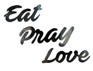
A good example of word art that is not “cut out” of a rectangular piece of steel (as in the example above) is Eat Pray Love. The words become standalone to be hung separately. Using one type of script font keeps most of the word together. A little creative editing pulls everything together.
Cutting out words and connecting them
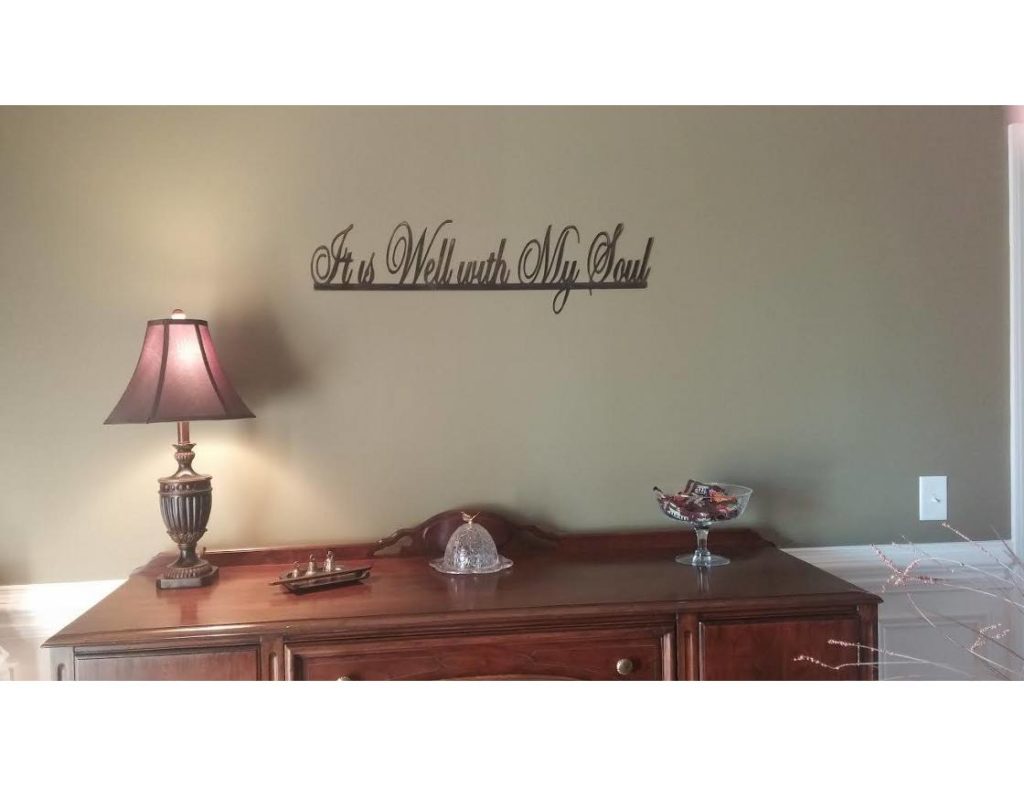
A favorite hymn becomes inspiration in the next example. The words in the hymn title were connected by a line. This works fairly well, but note that the “dot” of the i is not included. This becomes lost in the water table and is difficult to finish (too small – and Mike likes his fingers). You will see the dot of the i in the scripture example above.
The Double Layer Sign
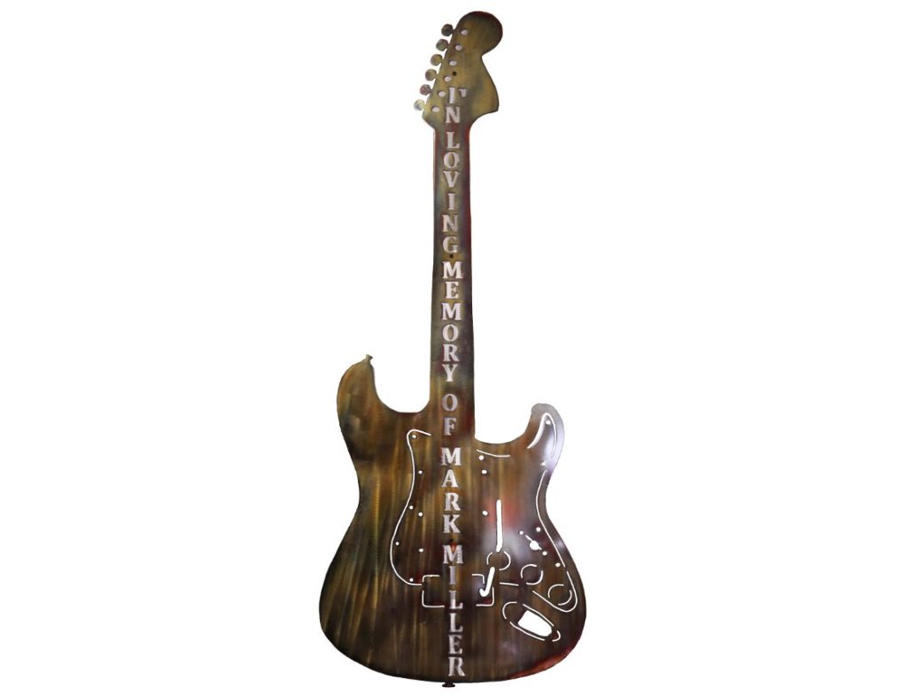
This method is perfect for house signs or a memorial. You get the contrast between the bottom and top layer and a very readable sign. The cost is a little more, but people are able to read your message. In this example, the guitar memorial would be installed in a garden. We recommended to the customer that a double layer would be best. Mike created a backing to go under the letters only, thus reducing the overall cost.
Using Text? Ask for our recommendation!
We work with customers to create the best result for their vision. We will ask you how you plan to use the finished piece. What is the backdrop? Is there special lighting? Other special considerations we need to know about? We’ll talk more about text considerations in upcoming blogs.
Just give us a call. We’d be happy to work with you!
